 Gettyimages
Barcelona might be getting a new crest - but will fans like it?
Fans get passionate about their club crests but sometimes change doesn't go down so well
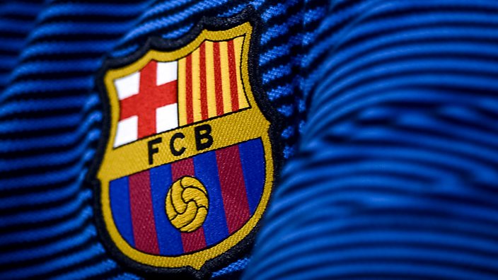
Barcelona recently unveiled a proposed new club crest.
What do you mean it’s exactly the same as the current crest?
It’s not! It’s LOADS different.
For a start, they’ve dropped the letters FCB. And then there’s the ball too – that’s bigger, isn’t it?
FC Barcelona worked together with a branding agency to create the new crest design, which is described on the company's website as "faithful to the roots and historic elements in the crest, while marking a new strategy and making it easier to reproduce, especially in digital media".
They describe their work with Barcelona as being part of a "global branding initiative", which involves adopting Barca as an “official brand expression”.
Confused?
Like it or not, this is the age we live in. Football clubs are not just locally-run pillars of the community anymore. Many are also global brands – with logos as much as crests.
But while the redesign may have evoked a mixed response, it's certainly not the most controversial example out there.
Different football clubs have tried their hand in this new marketing space in recent years, with varying degrees of success. Here are a few that have not gone down so well with fans.
Leeds United
 Gettyimages, Leeds United
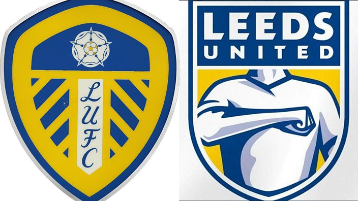
Back in January, Leeds United announced they had given their crest a makeover for the new year. It took six months of research and 10,000 people were consulted. We can only assume the 10,000 people they spoke to were all Manchester United fans.
Either way, it wasn’t universally popular.
There was a lot of speculation about where the design idea might have come from, whether from the world of cinema…
Or the world of heartburn relief…
Either way, after more than 77,000 people signed a petition asking owner Andrea Radrizzani to stop the launch of the design, the club delayed its release which was planned to mark their centenary in 2019.
A statement from the club said the release of crest had been delayed “due to the volume of ideas and designs submitted by fans". ”We would like to take this opportunity to thank all fans for the inspiration they have provided which, following further consultation with supporters’ groups, will form the basis of a democratic vote later this year.”
There’s no news yet on any more designs.
Juventus
When Italian giants Juventus rebranded their classic black and white crest for a new design in 2017, it left many scratching their heads.
The Italian champions - who boast one of the finest nicknames in the game - rolled out the red carpet to unveil the new logo and the internet soon reacted, with many showing no intention of going easy on 'the Old Lady'.
Despite Juve pulling out all the stops with an epic publicity campaign, it felt more like a cringe-worthy TV advert promoting a new men's fragrance - not a football team.
Everton
 Gettyimages
Another example of fan power winning out.
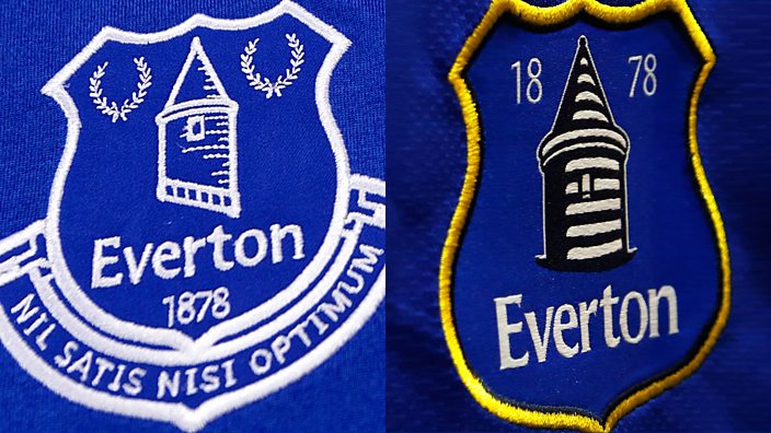
Everton are a proud club with a fanbase who are very invested in their history. So any rebrand that ignores that history is likely to be met with some scepticism.
In 2013, the club unveiled a new crest which simplified their existing design and, perhaps most strikingly, did not include the motto that had been part of the club for 75 years, Nil Satis Nisi Optimum, which means "nothing but the best is good enough".
Fans obviously decided this design wasn’t good enough anyway. More than 23,000 supporters signed a petition to scrap it and it was subsequently abandoned.
Cardiff City
 Getty Images
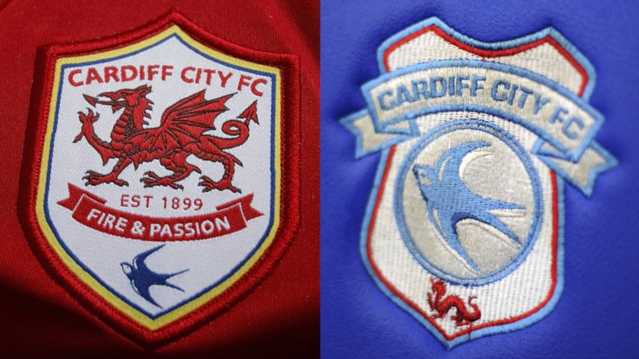
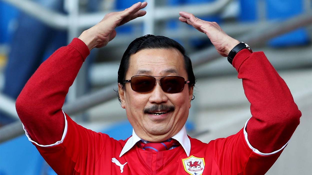
When Malaysian billionaire Vincent Tan took over as owner of Cardiff City, he made a fair few controversial changes which didn’t go down too well with the fans.
One of his first actions was to strip Cardiff - nicknamed the Bluebirds - of their iconic blue emblem, trading it in for a red dragon. And if that wasn’t enough, he then went on to change the club's kit from blue to red because of the colour's “strong spiritual significance in Asia".
 Getty
Getty
Tan even went as far as considering changing the club's name to the Cardiff Dragons, although that eventually fell through.
Following several disputes with the supporters, Tan eventually allowed the club's home kit to be changed from his favourite red back to the original blue. He also later agreed to change the crest back to a bluebird, but with a tiny Welsh red dragon at the bottom.
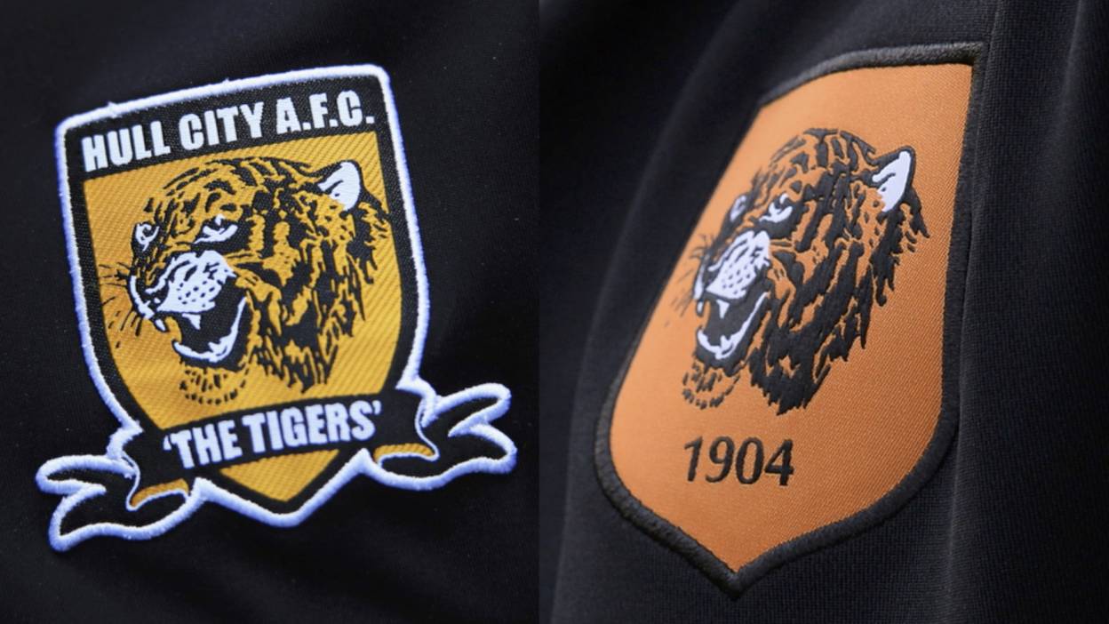
Hull City
 Getty Images
Hull City's nickname is the Tigers, but chairman Assem Allam brought on the wrath of the club's fans when he said he wanted to change the official name to Hull Tigers.
Allam thought the American-style name would make the club more popular around the world but fans formed a campaign group called City Till We Die.
The chairman's response was extreme. “They can die as soon as they want,” he said.
He then commissioned plans to revamp the logo by removing the club's name entirely and only featuring a big tiger's head with the year the club was founded.
The marketing blurb said the new design was "clean and stylish with a modern feel" - after all, nothing says modern like 1904...
Aston Villa
After winning only three league games throughout the entire season, 2015/16 was not a year when the owners would want to get on the wrong side of Villa supporters.
Obviously, they didn’t receive the memo, and were criticised again by their irate fans for splashing out a whopping £80,000 on a big rebrand of the club crest.
The big changes were removing the word ‘prepared’ and making the lion look a bit bigger. No, that was it. Just that.
The talk was that the changes would make Villa "more effective in the digital age".
While £80,000 may not seem like a lot in modern football, after a season which saw the club relegated from the Premier League, it showed they were far from prepared at all.
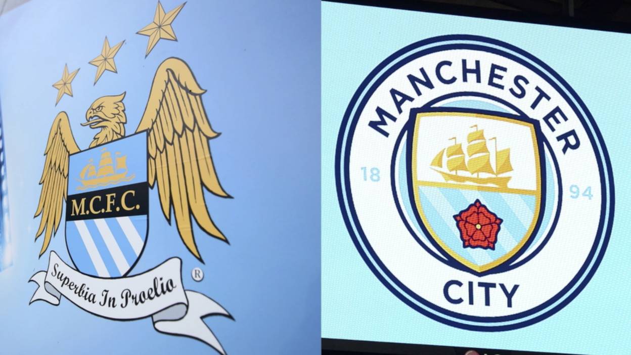
Manchester City
 Getty Images
Having rebranded their stadium and built an expensively assembled squad to rival the best in the Premier League, the only thing left for Manchester City to change under owner Sheikh Mansour was the club's emblem.
The new design for 2016/17 was a throwback to the classic logo the club had used from the 1970s through to the late 1990s.
It replaced the strangely Roman-themed eagle and stars design and received generally positive reviews when the club released the image from a spotlight on the side of Manchester’s Town Hall.
Representatives from the club claimed the new/old badge was “a modern original" with "echoes" of the past, as it signalled the start of the Pep Guardiola era at the Etihad.
Article originally published 17 January 2017
WANT MORE?